Brand Guidelines
These guidelines were created to inspire you when creating brand communication and graphic expressions that are cohesive and convey who we are, what we do, and how we add value. Stick to these guidelines to make our brand loved and recognised globally.

Logo
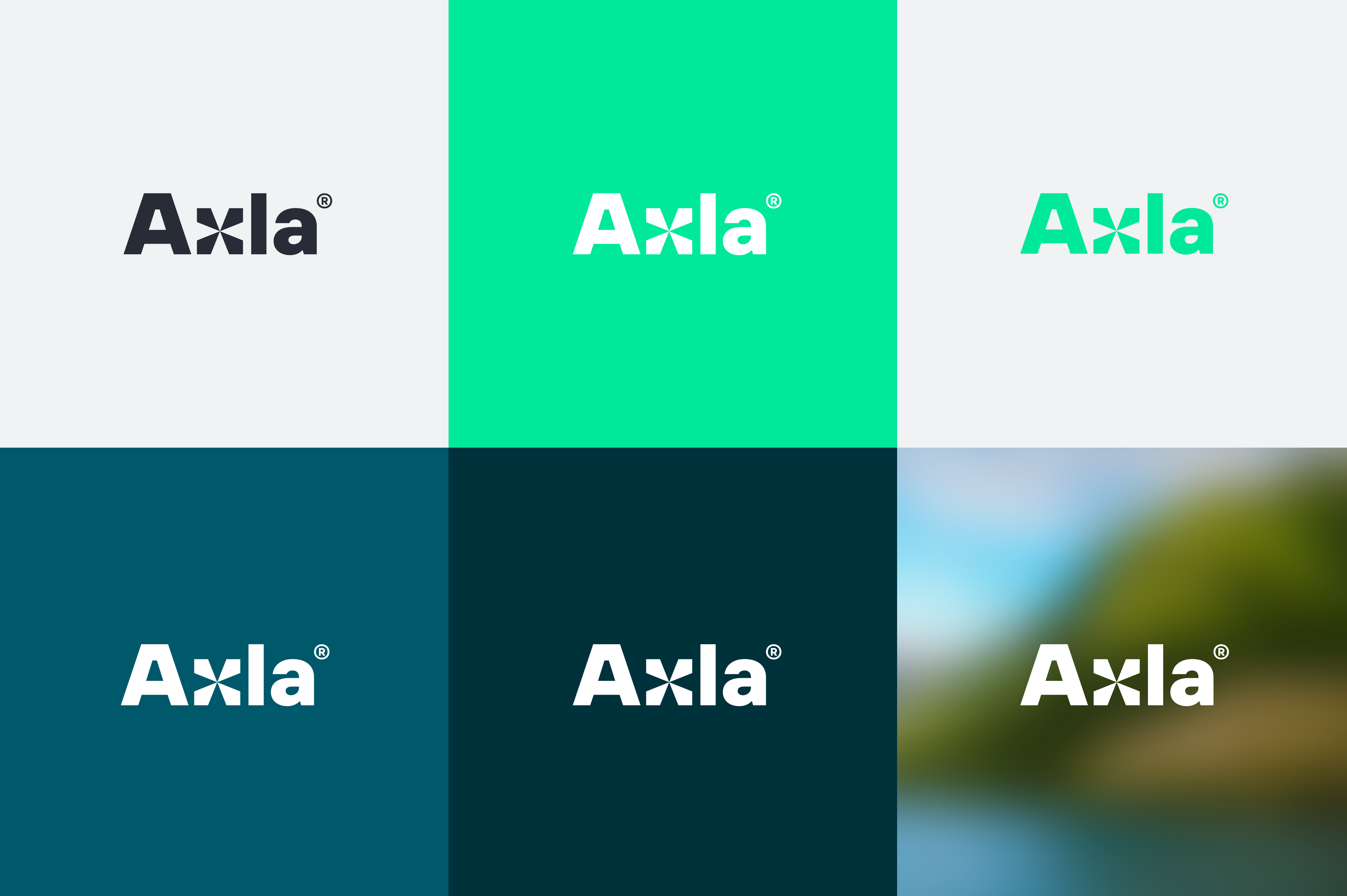
This is our logo. The logo can be used in black, white or bright green. Please use the logo against solid coloured backgrounds. The black and bright green logos should only be used agaist white backgrounds. If the logo must be used over an image, always stick to the white logo.
Please do not alter the logo by rewriting, adding effects or changing it or it's proportions in any other way either – we like it as it is.
Make sure you have the latest logo files in use by downloading the assets from the link below.
Logo
Usage
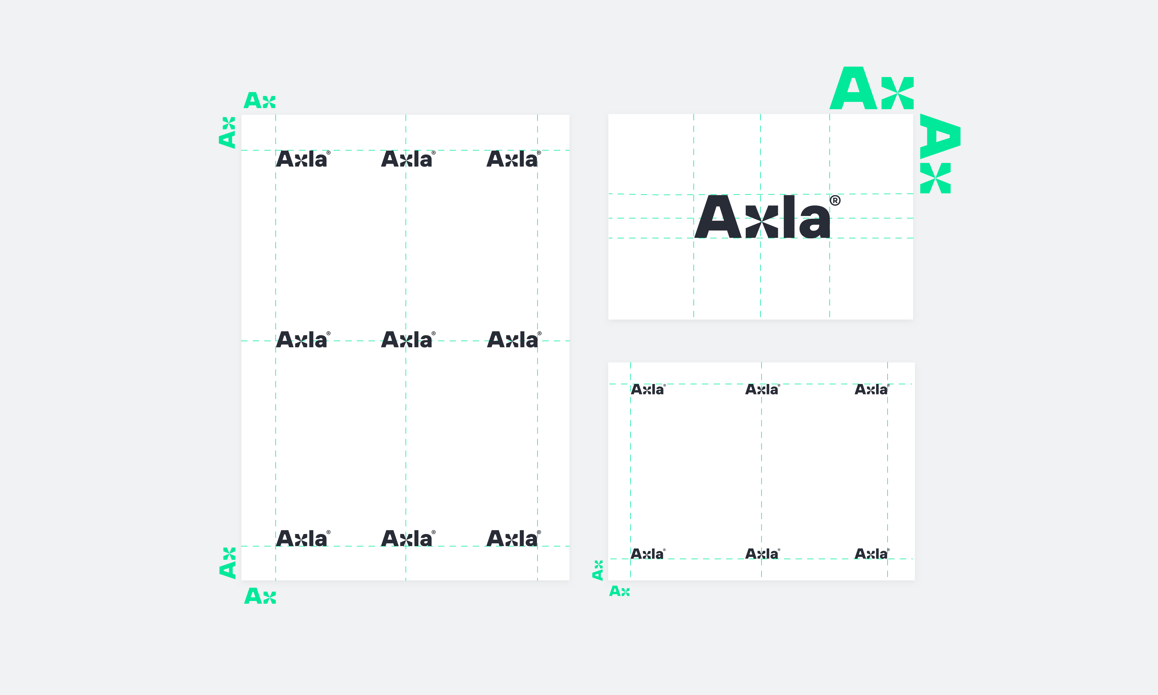
Please leave sufficient spacing around the logo. The logo should always be placed in one of the corners of the layout, preferrably in the upper left corner.

Color
Brand Colours
Colour is an instantly recognizable element that defines our brand identity and makes its stand out. Applying the core colour palette will help create strong and cohesive visual communication through out all our communication channels.
Please note that the muted bright green and the different shades of grey are reserved for digital expressions only.
-
Axla Electric Green - Screen & PMS
Pantone: 2412 C
RGB: 0 233 154
HEX: #00e99a -
Axla Bright Green - Screen Text
HEX: #00CC8D
-
Axla Bright Green - Print & Paint
CMYK: 65 0 55 0
NCS: S2040-G10Y -
Axla Blue 1
CMYK: 77 21 25 33
RGB: 19 116 134
HEX #357283 -
Axla Blue 2
CMYK: 86 20 23 53
RBG: 0 88 107
HEX: #00586B -
Axla Blue 3
CMYK: 86 20 23 75
RGB: 0 50 60
HEX: #00323C -
Axla Background Grey Bright
HEX: FAFAFA
-
Axla Background Grey Light
HEX: #F3F3F3
-
Axla Text Grey Medium
HEX: #7E8A96
-
Axla Text Grey Dark
HEX: #282C36
Colour
Colour in backgrounds
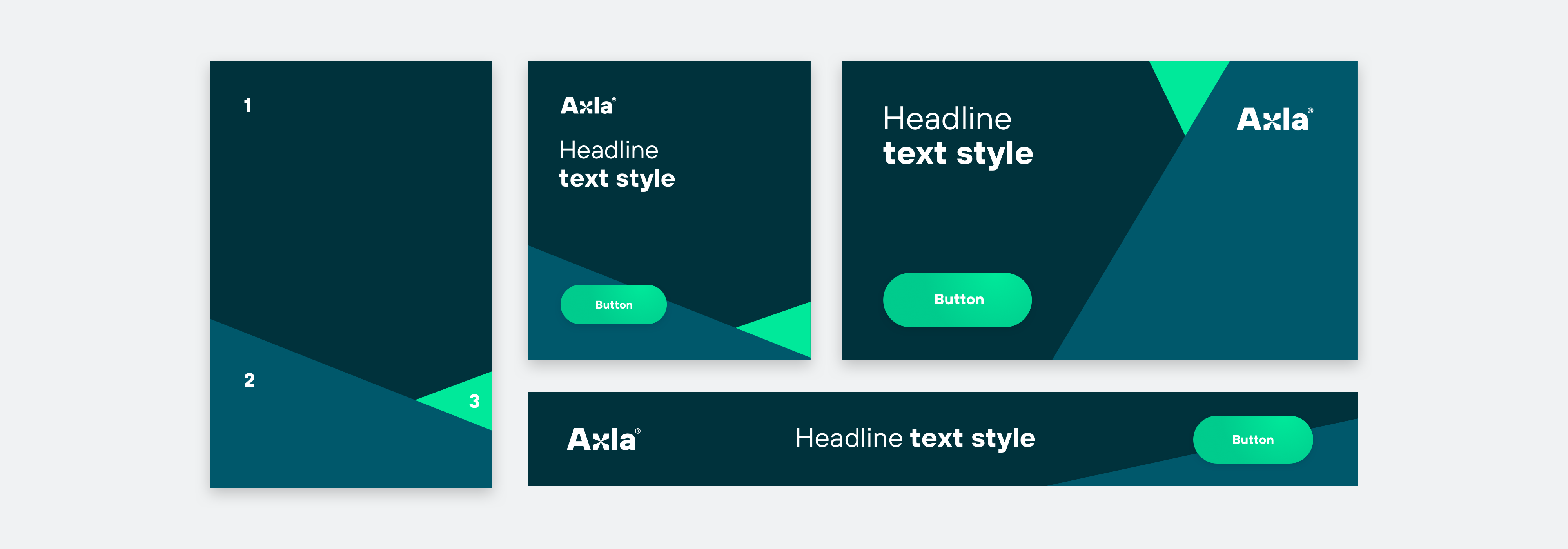
Graphic colour blocks can be used as backgrounds in digital expressions. Please avoid text overlapping the inetrsections of the graphic areas. Use colours in the order and proportions described in the example.
Typography
Typography is a central part of our identity. A consistant use of typography is fundamental when building a strong and recognisable brand.
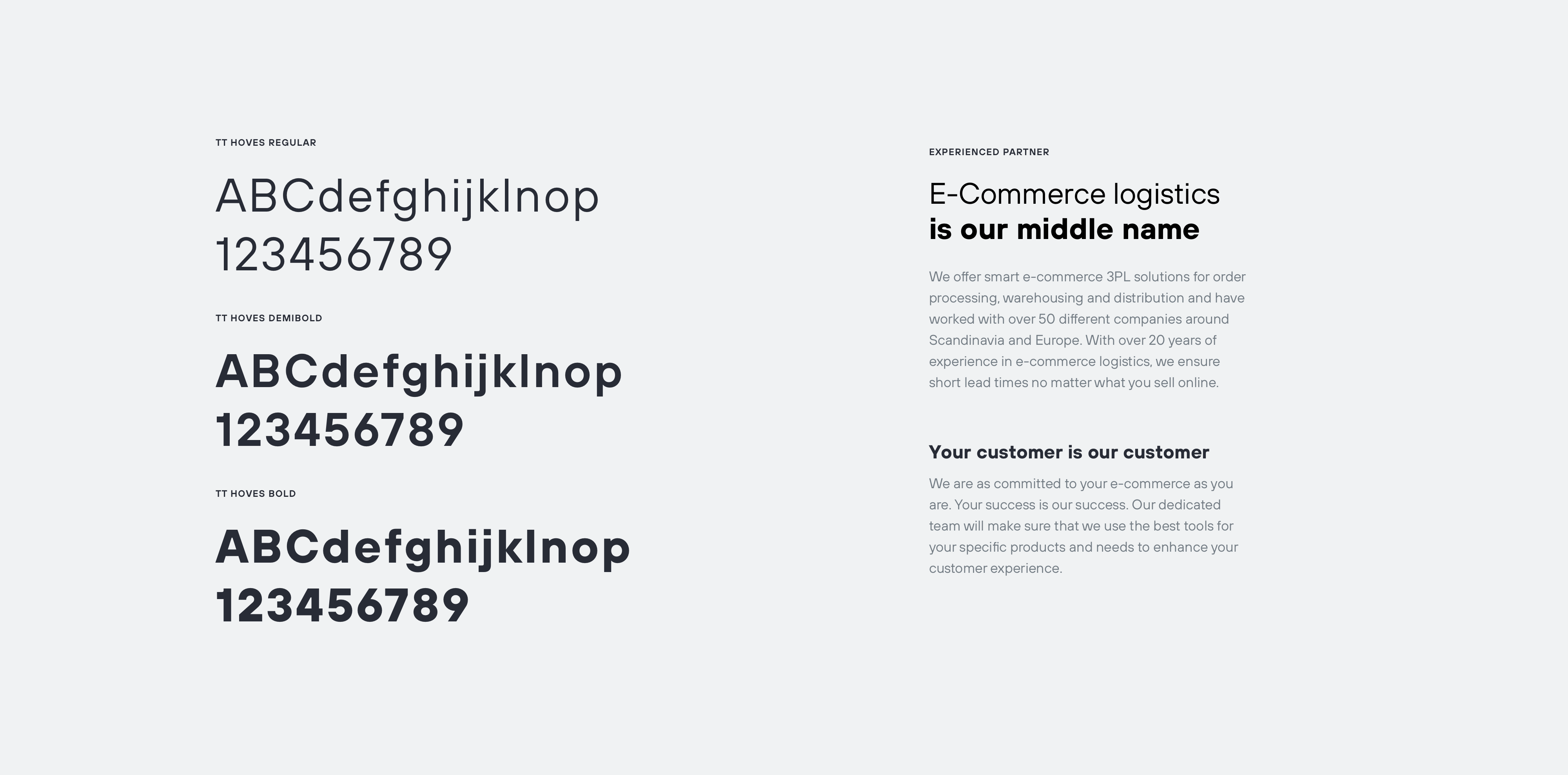
The main font of Axla is TT Hoves bold and regular. The fallback option for TT Hoves os Arial. Arial is to be used in all internal documents such as PPT presentations and Word documents.

Illustrations
We use illustrations to help visualise our offering and the service we want to provide our customers.

Brand Expressions
An overview
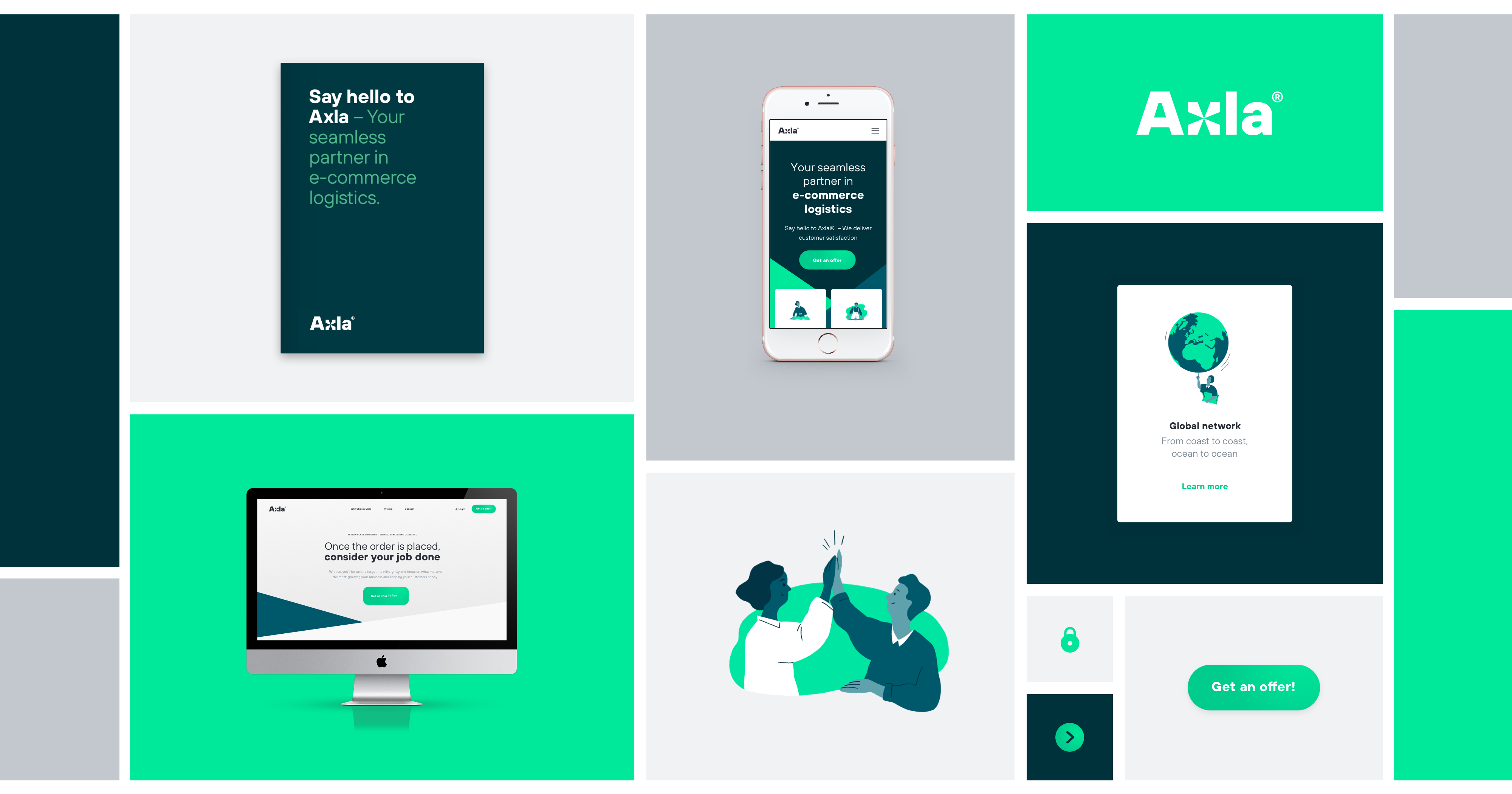
We have a clear identity wherever we express ourselves. Clarity comes from not using too many styles, sizes, colours or messages at once. A simple message expressed in bold type often does the job.
Sticking to these design principles helps creating coherence and brand recognition across a lot of different touchpoints.
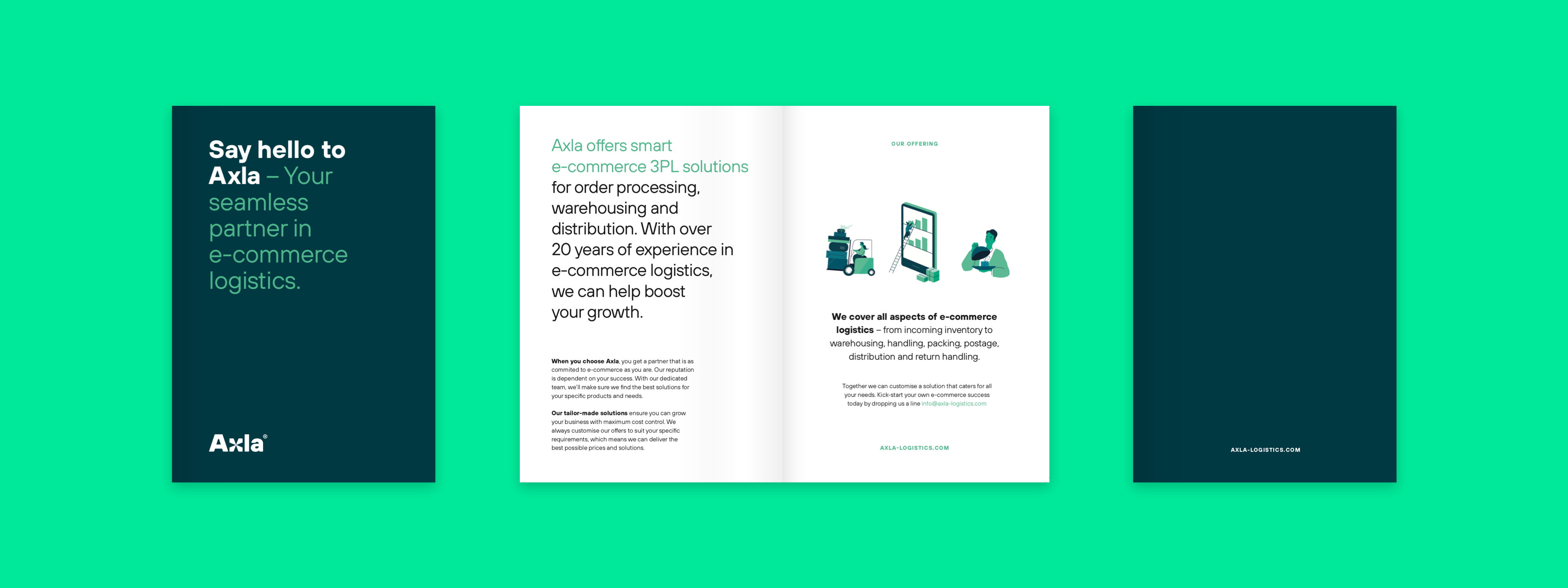
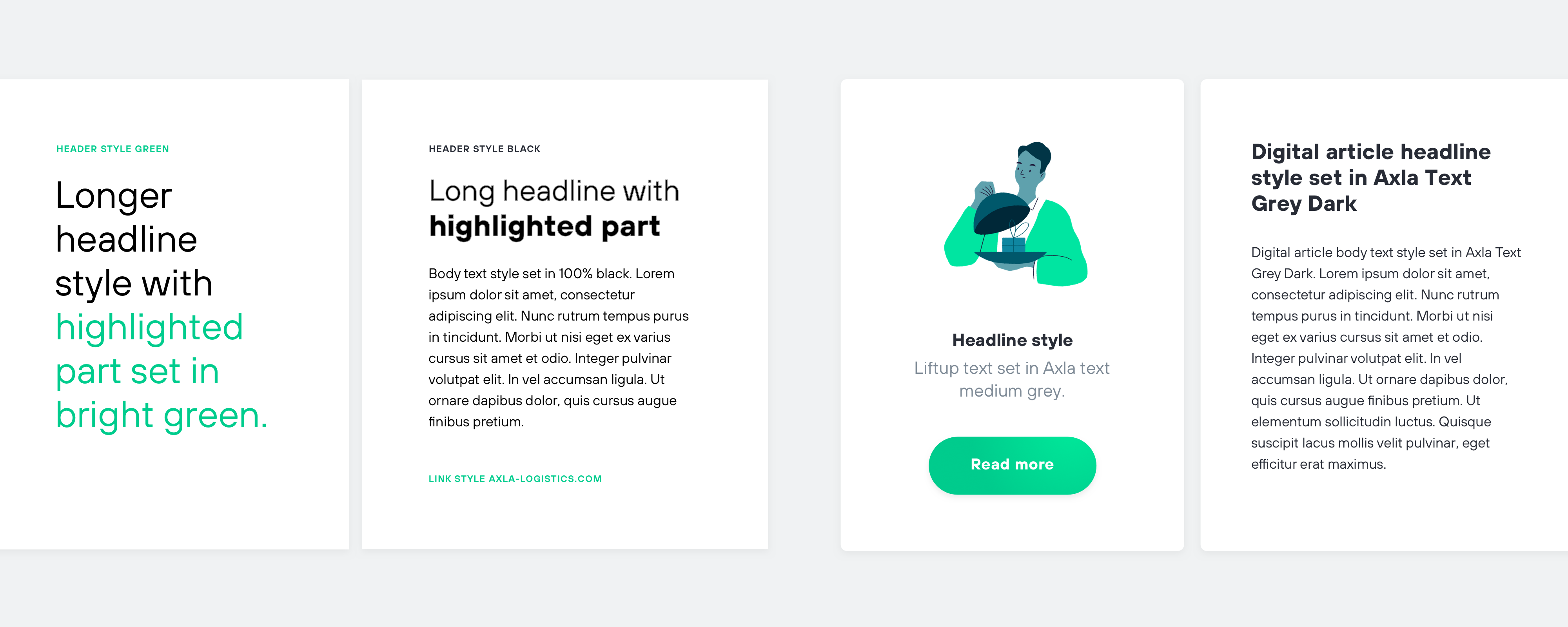
Typography & Layout
Print & Web
-
Layout
A left aligned layout is to be preferred for most layouts. A center aligned layout works best for digital lift-ups and should be used sparsly.
-
Colour
Print – In body-copy stick to 100% black for best legibility. For links or highlighted texts use bright green.
Web – Use dark or medium grey for a softer expression. -
Header
Use Bold or Regular set in All Caps with +80% tracking.
-
Headlines
Mix Regular & Bold set with -20% tracking.
-
Body Text
Stick to Regular.
-
Subheadlines
Use Bold but keep the point size the same as the text.
Contact
If you need any assistant in working with these guidelines do not hesitate to contact brand@axla-logistics.com